No Molestar —Custom Type Family

eng.
The design team at Star Channel trusted us to design the brand-new custom type family for “No Molestar!” tv show, home of The Simpsons at Star Channel.
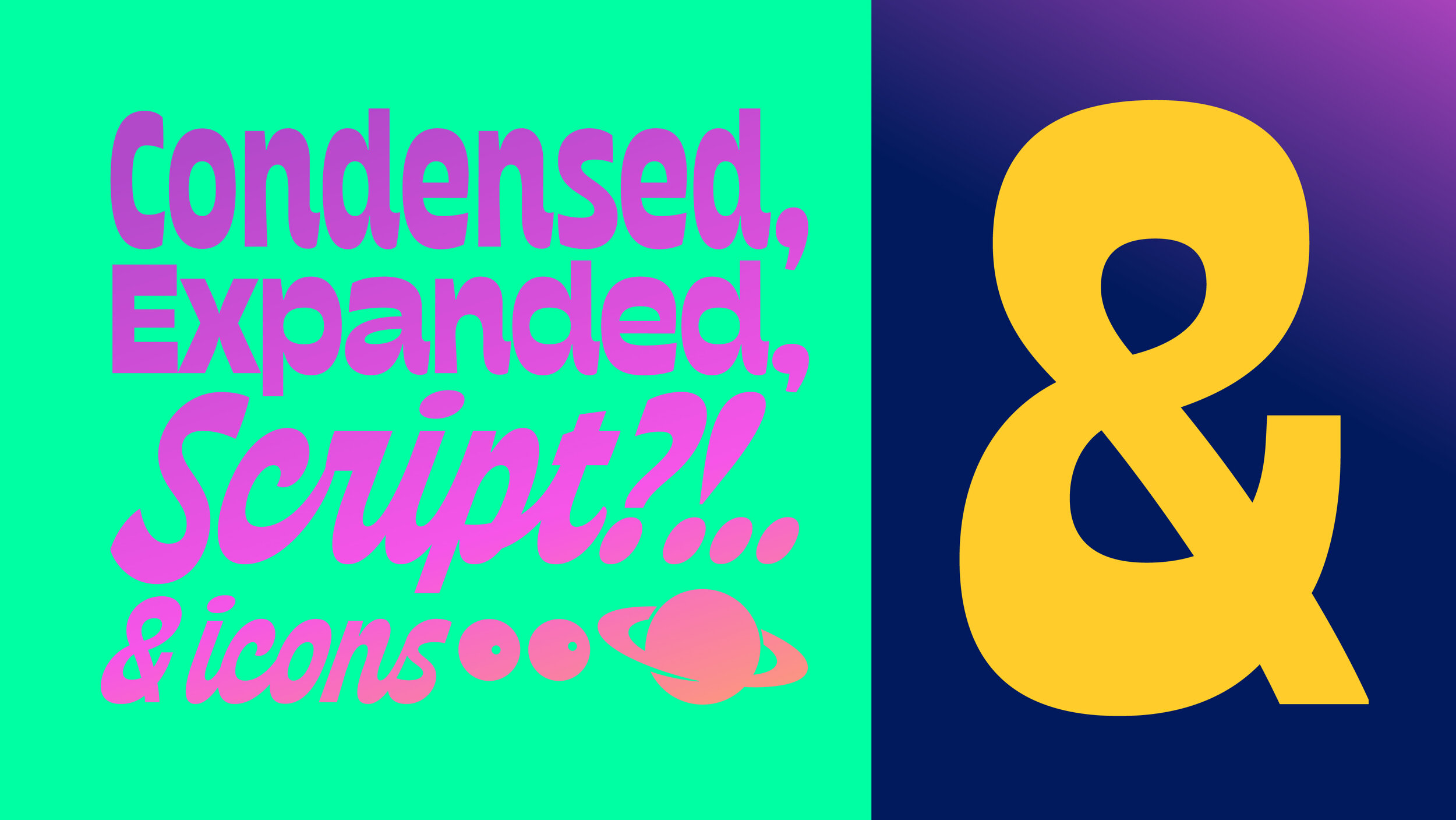
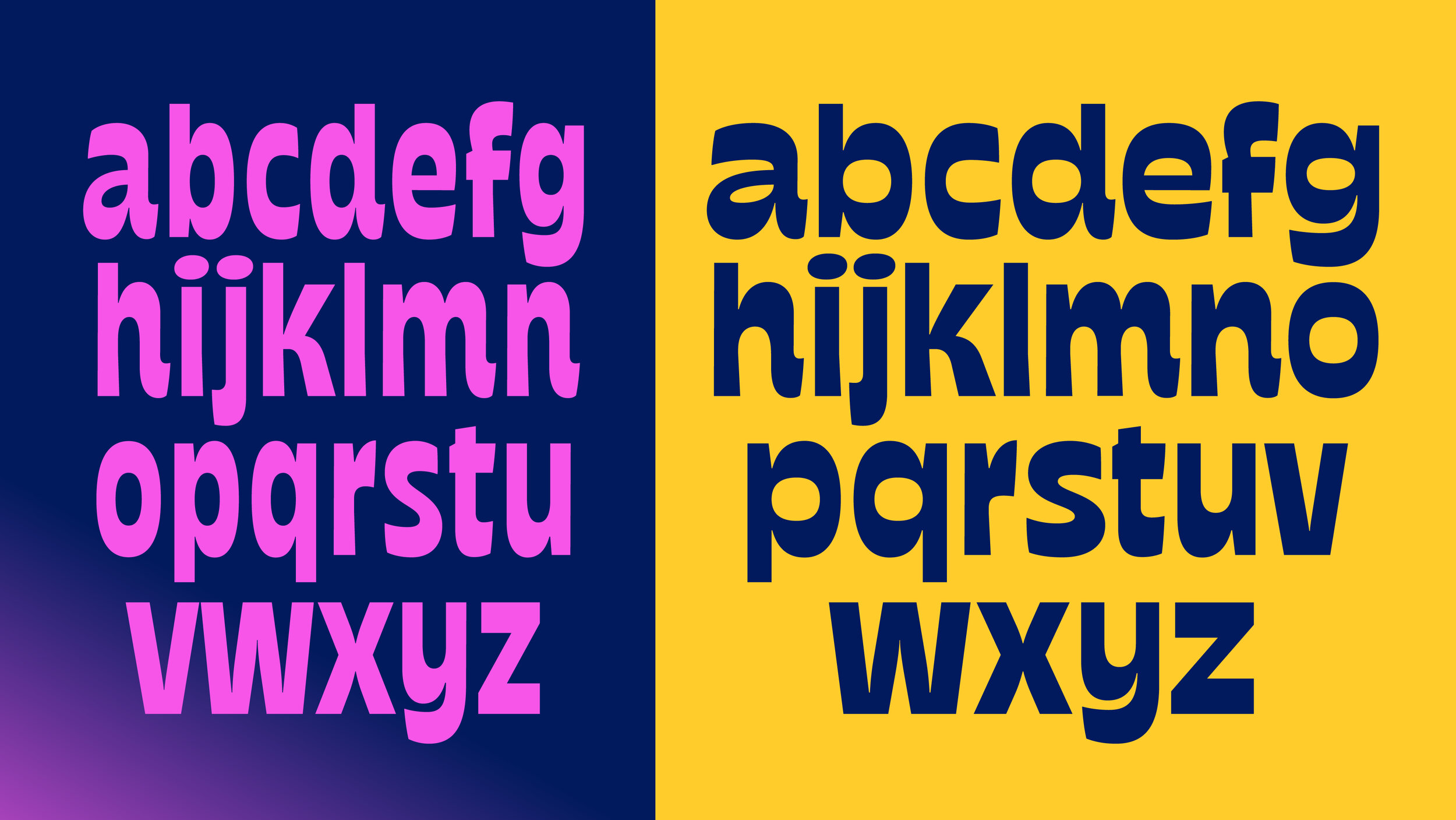
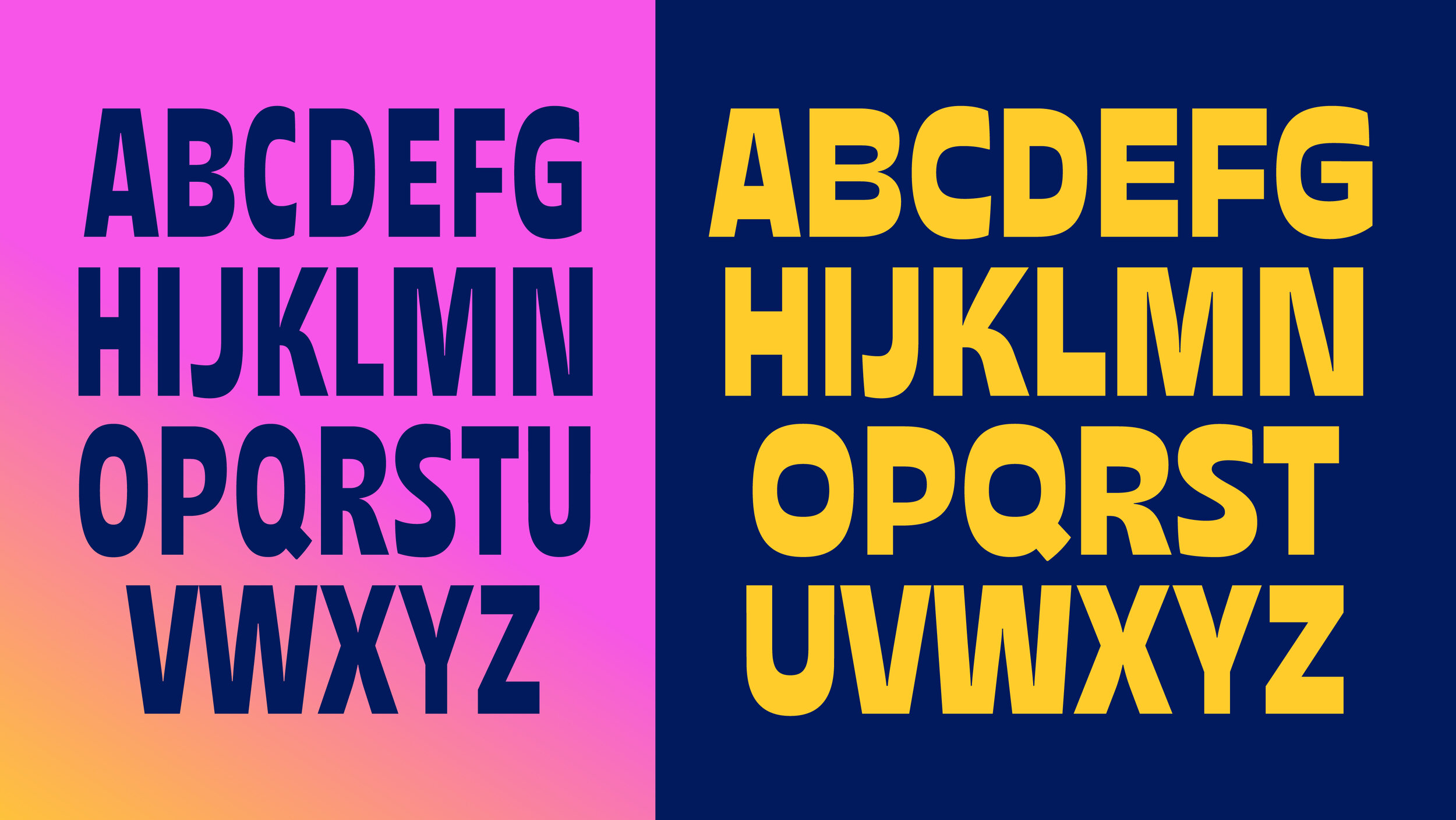
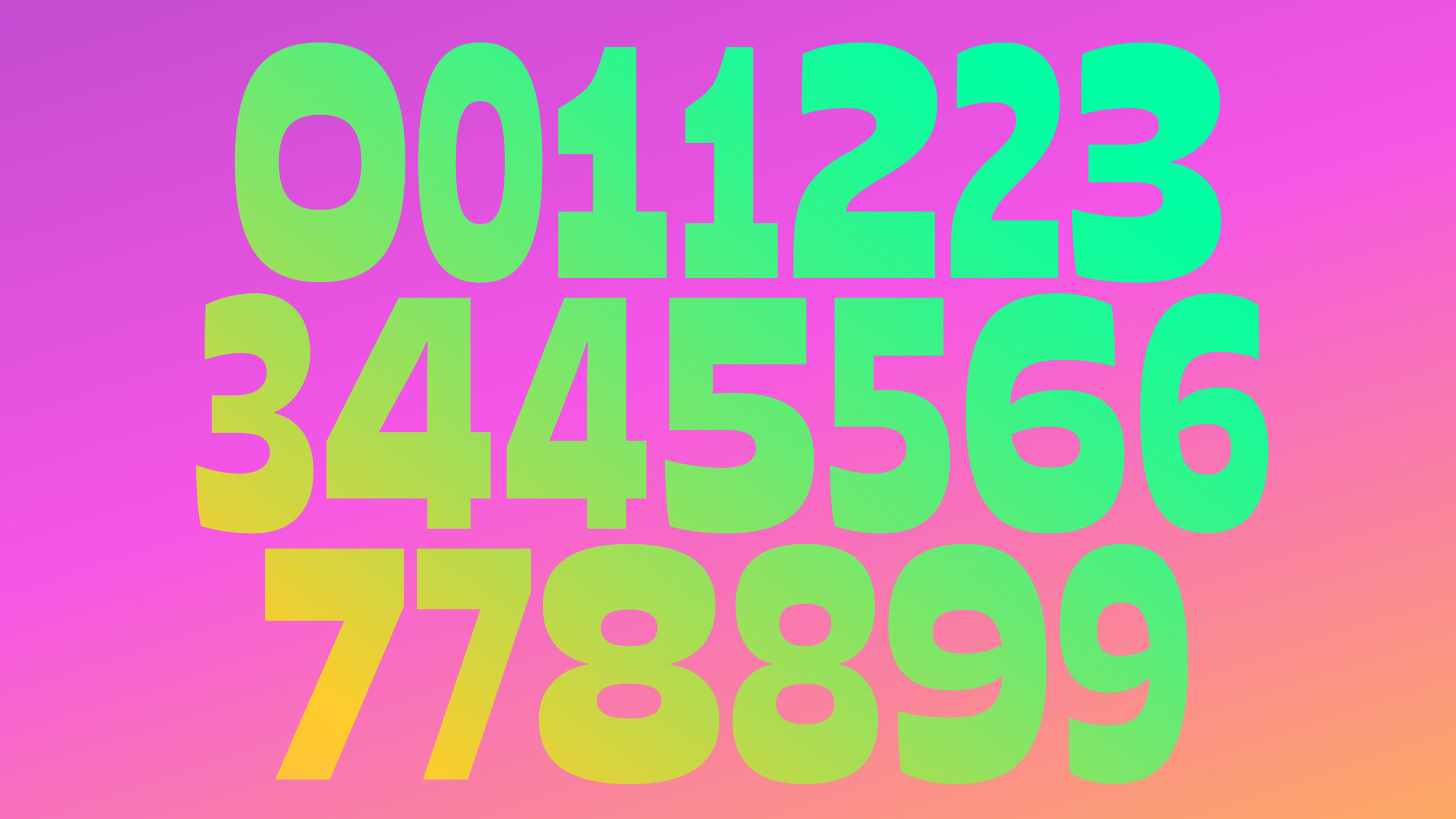
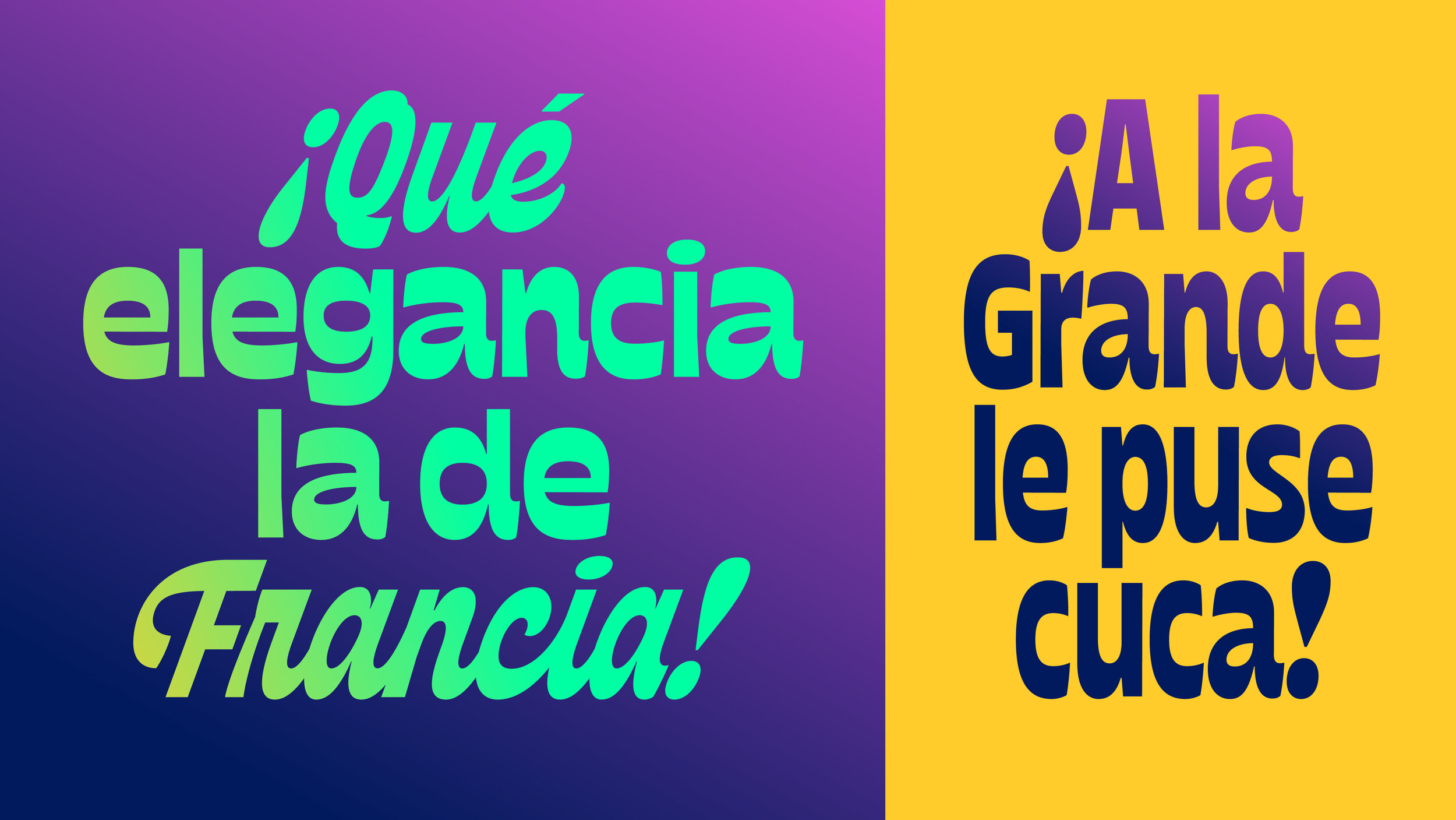
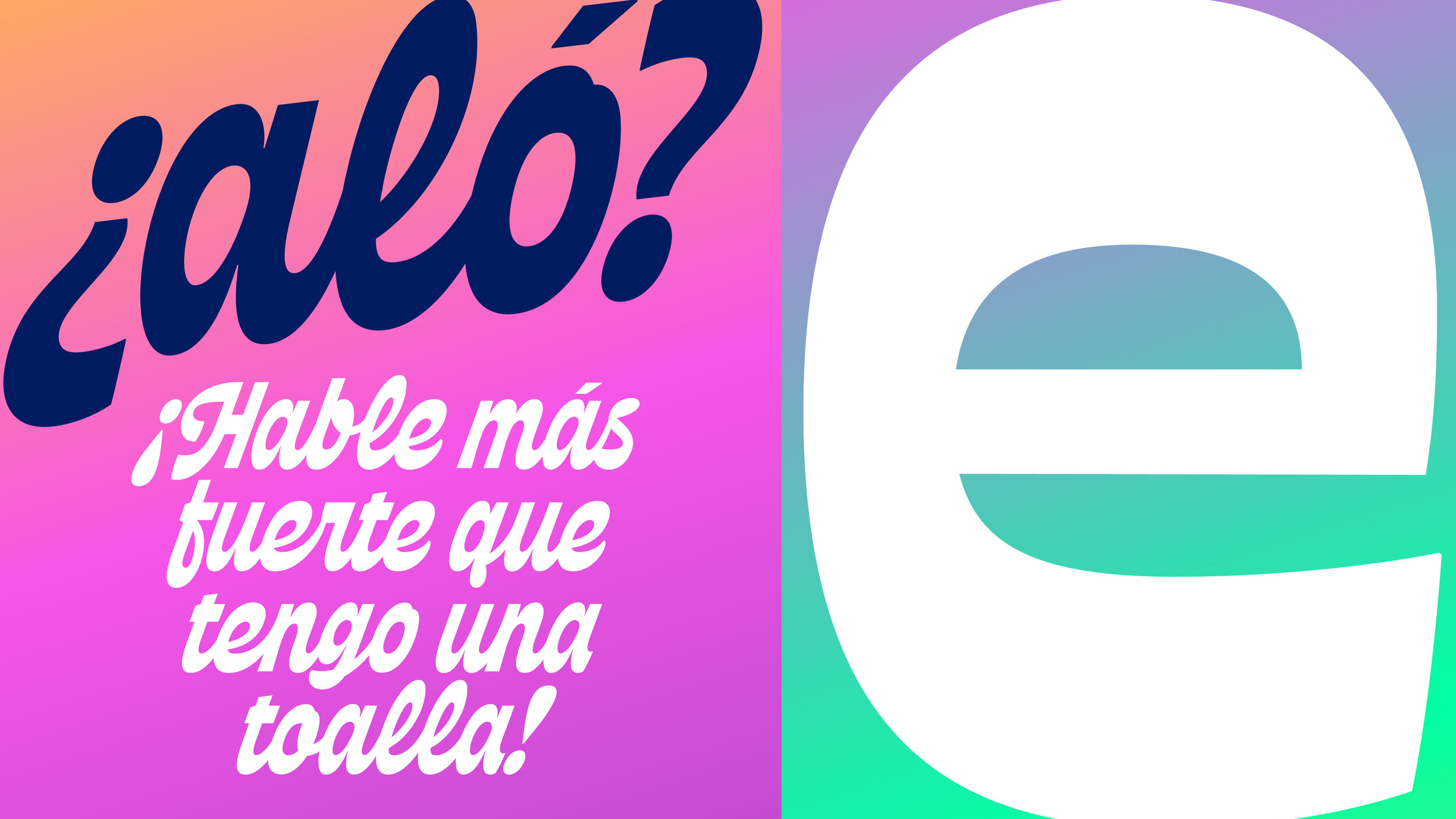
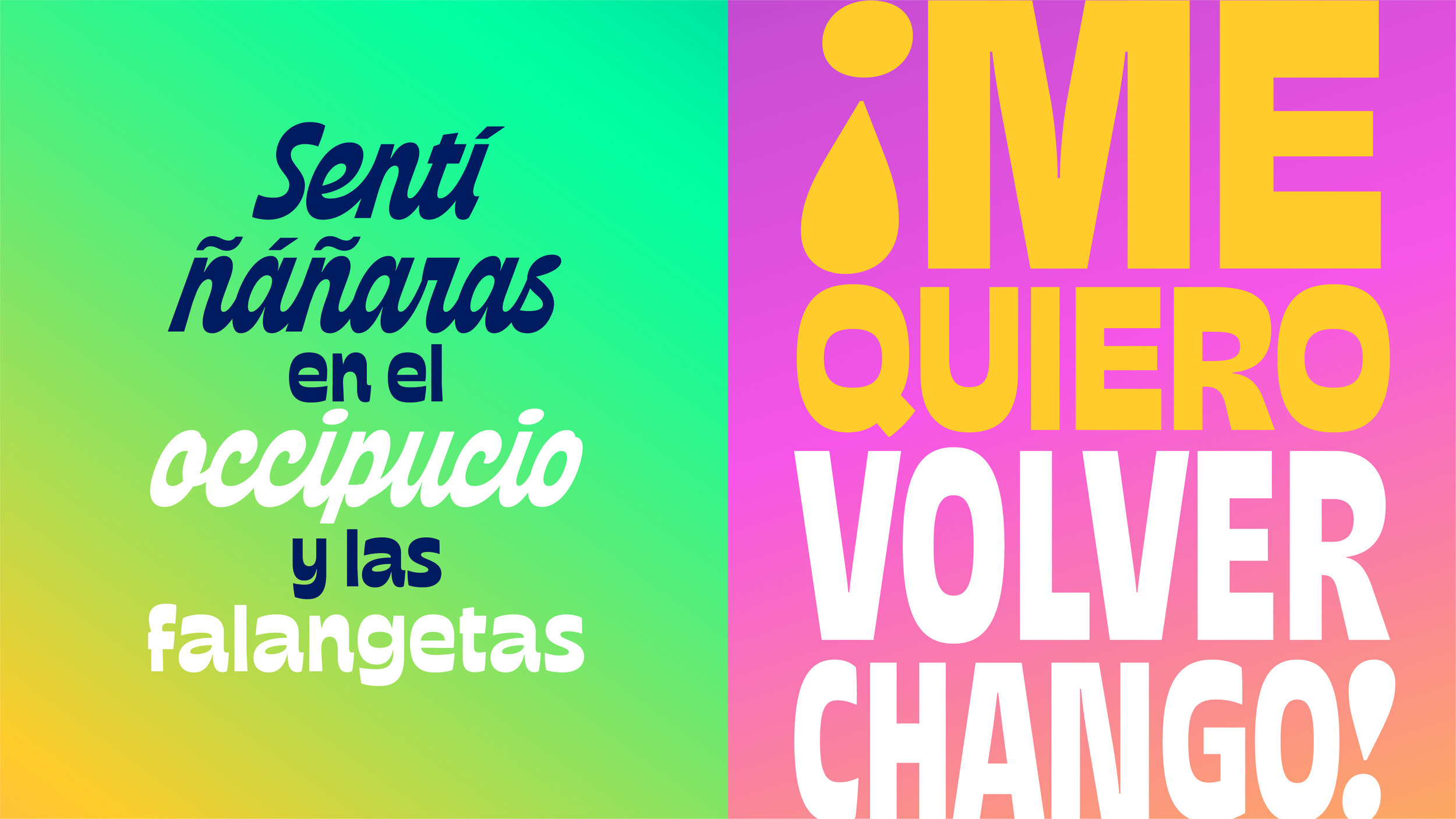
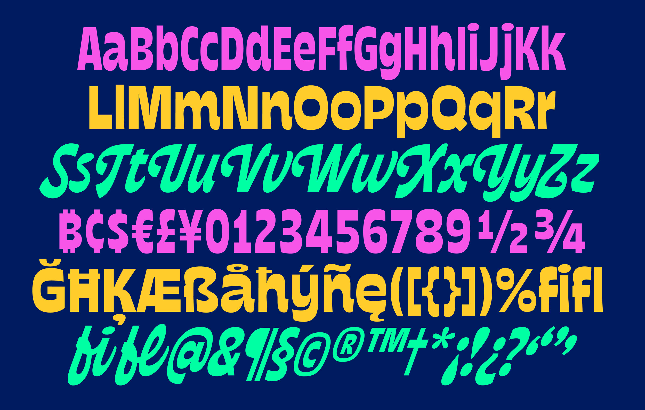
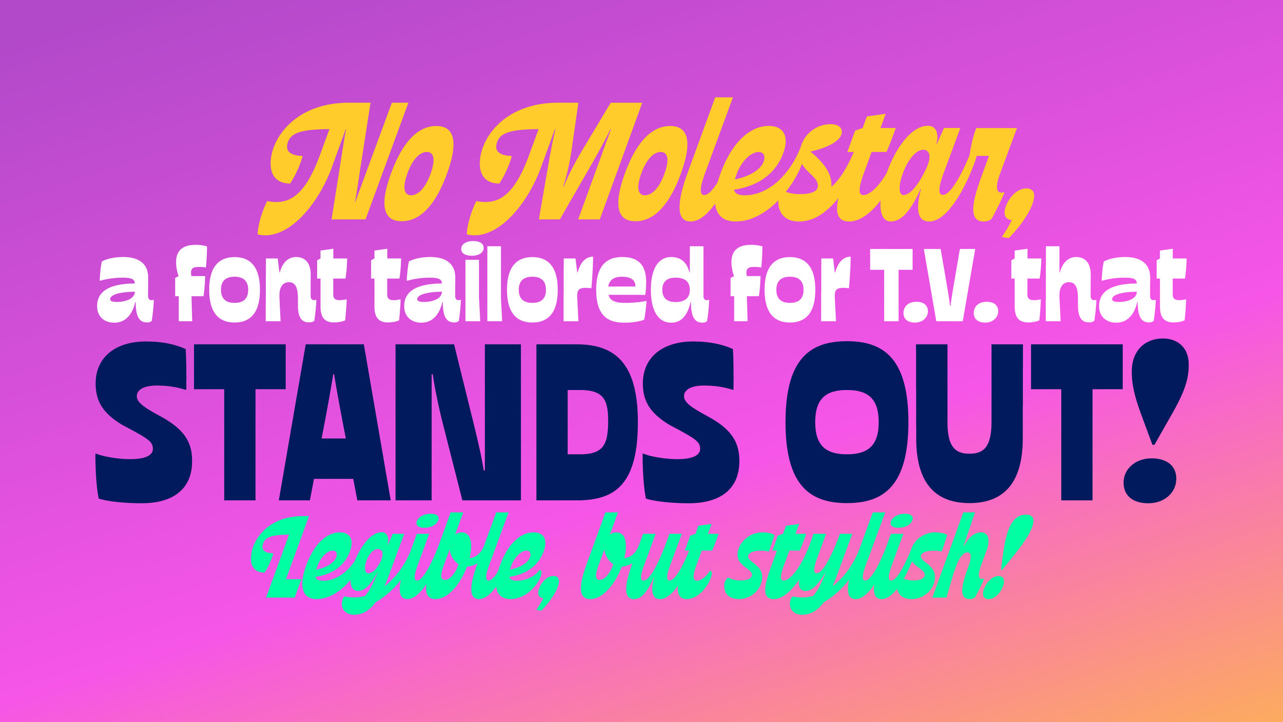
Regarding the family, its morphologic DNA responds to the show’s personality, which can be described as irreverent, mischievous, cocky, and absurd. In that way we built from the ground up a display Sans Serif system governed by an inverted contrast essence, with a notable typographic color and open counterforms to improve legibility.
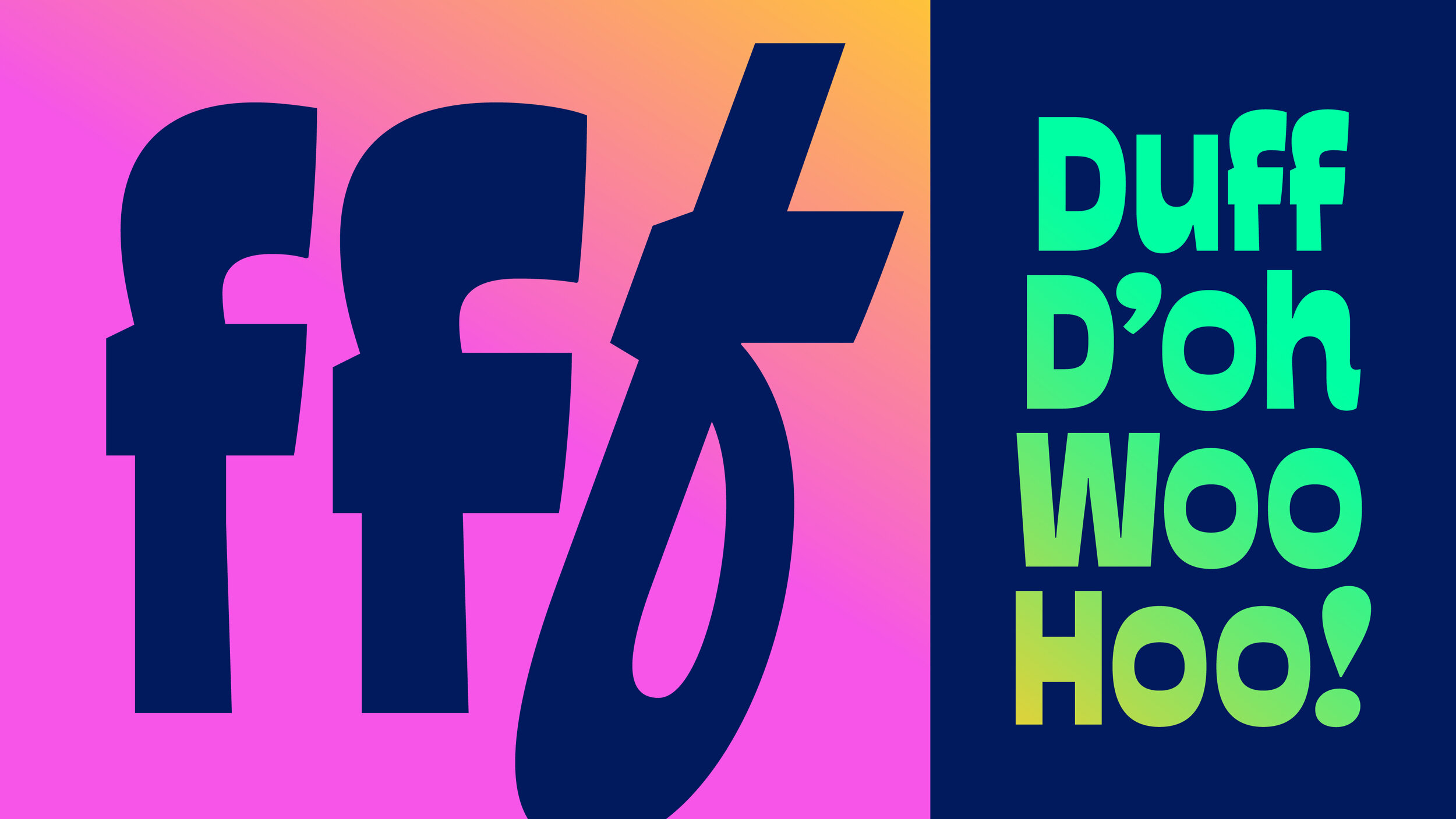
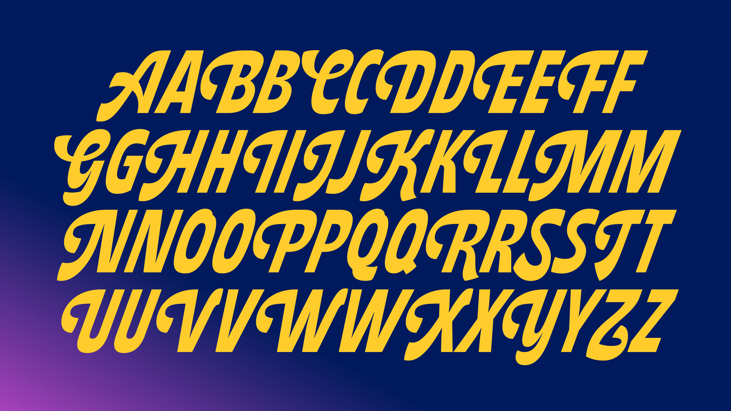
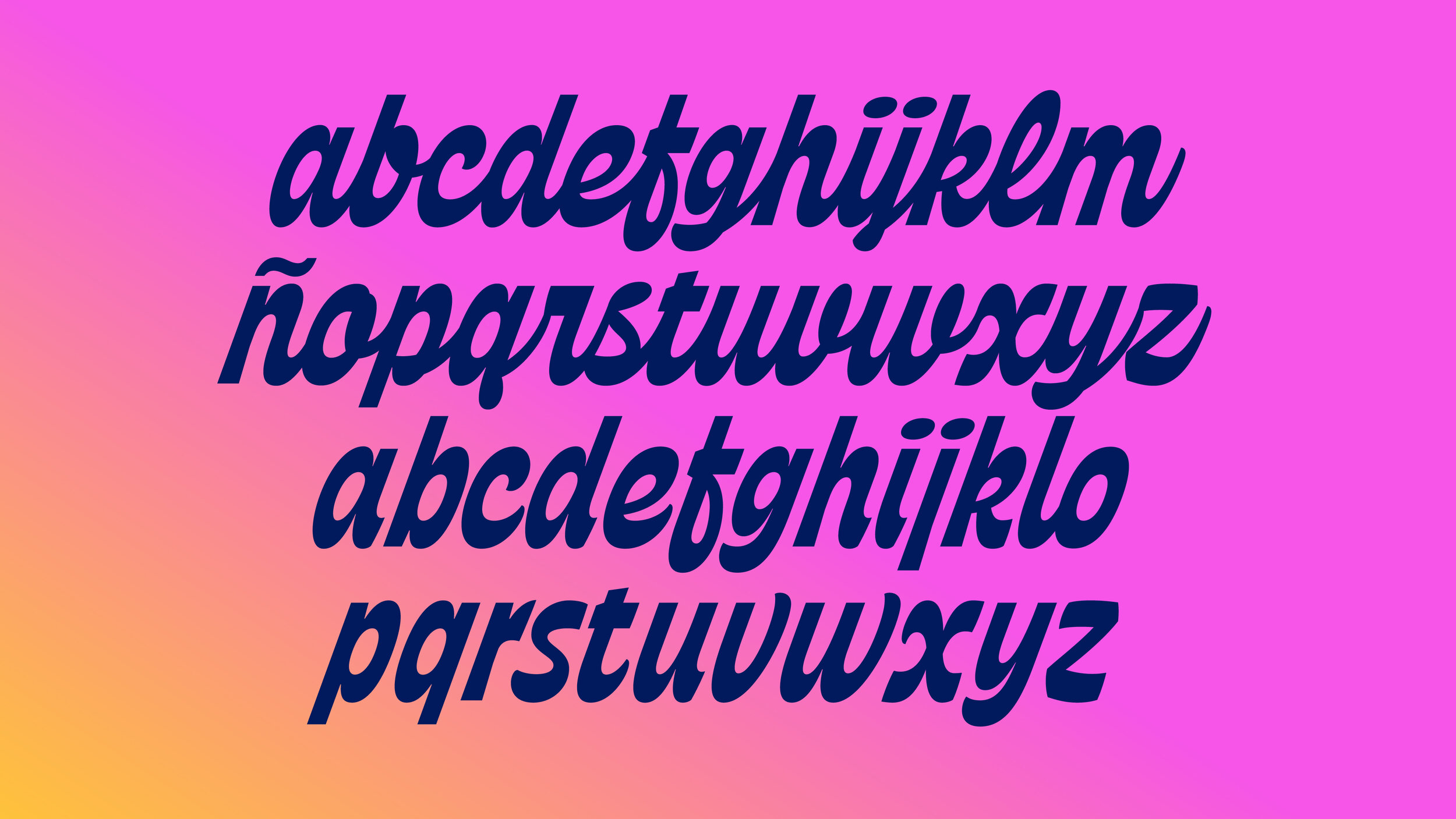
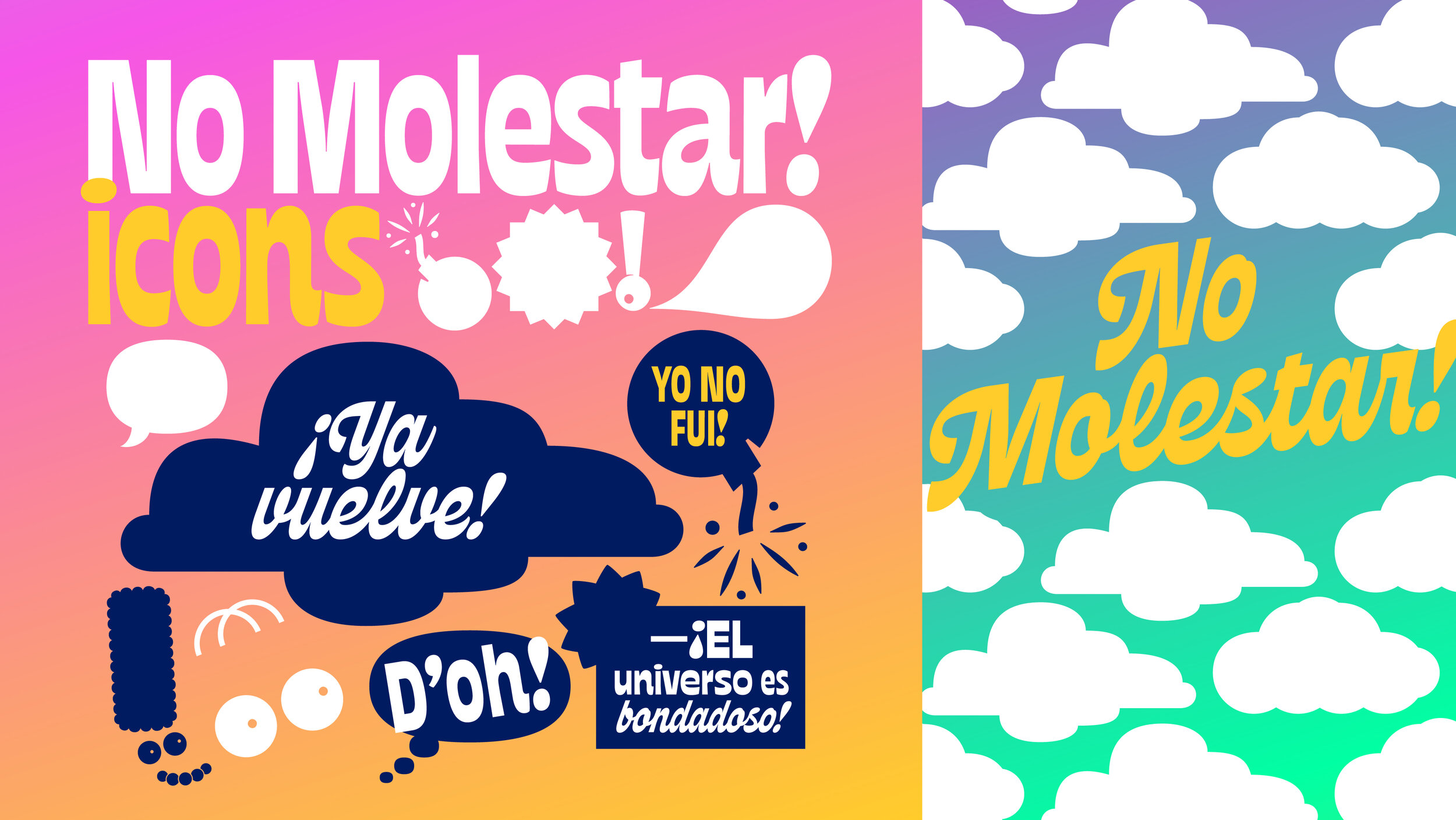
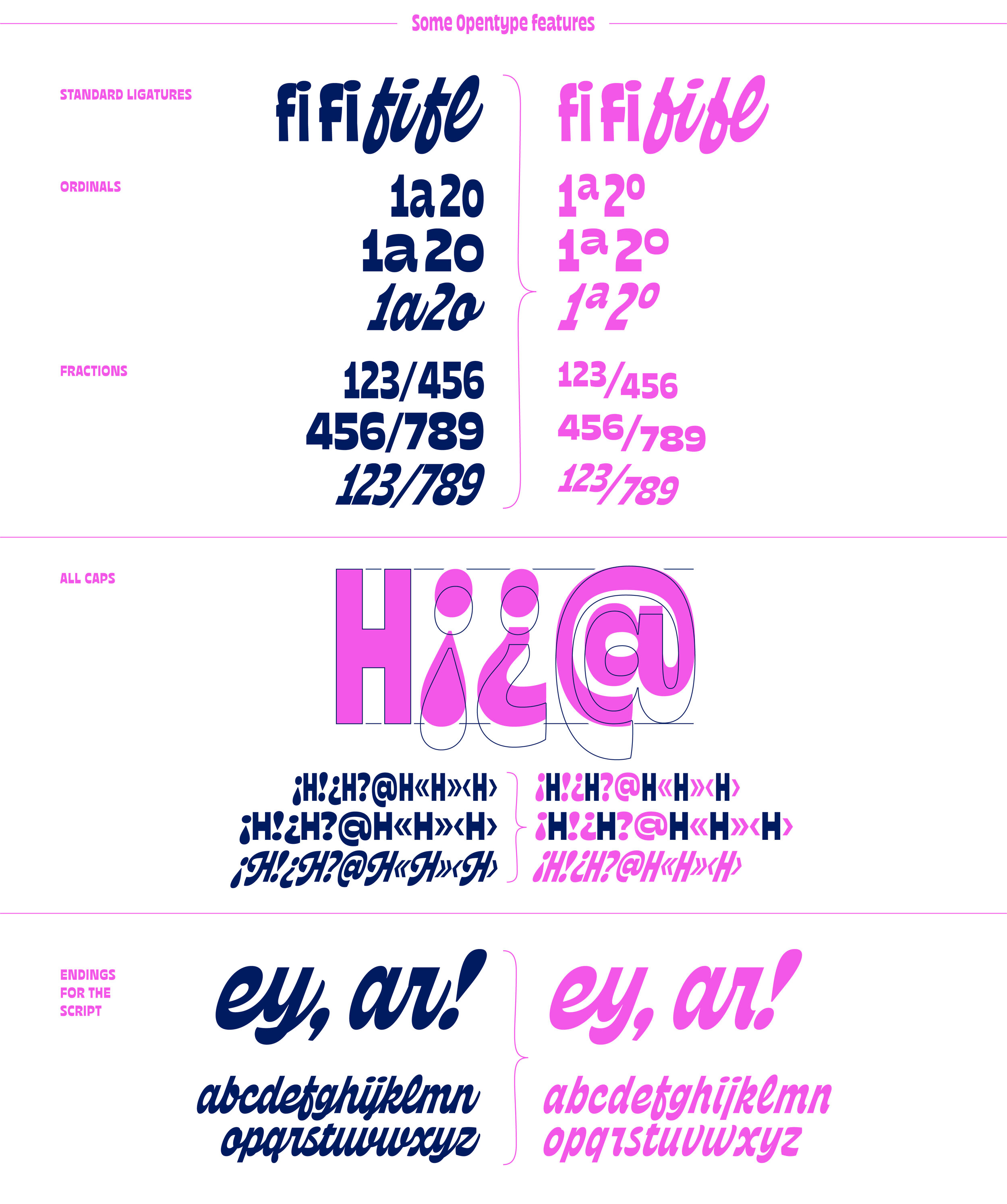
The family consists of four fonts in total. The two Sans Serif fonts were meant to compose titles with two tones of voice; the Condensed version to create strong messages with high impact and the Expanded to make words stand out. The Script reinforces that inverted contrast idea, starting out from an italic version of the Condensed, but then turning into an authentic cursive. Just like a fresh breeze of air, it allows the tv show to speak with informality, grace and a great deal of irony. Finally, a font full of icons serve as a complement to build different types of messages and arrange information.
esp.
El equipo de diseño en Star Channel nos contactó para desarrollar la nueva familia tipográfica para el bloque “No Molestar!”, hogar de Los Simpsons en Star Channel. Sobre la familia tipográfica, su ADN responde a la personalidad del show –irreverente, travieso, arrogante, y absurdo. Teniendo esto en mente construimos desde cero un sistema Sans Serif display regido por un trazo de contraste invertido, con un color tipográfico notable y contraformas bien abiertas para reforzar la legibilidad.La familia consiste en cuatro variables en total. Las dos Sans Serif fueron creadas para componer títulos con dos tonos de voz; Condensada para crear mensajes de gran impacto y Expandida para hacer que se destaquen. La Script refuerza la idea de contraste invertido, partiendo de una versión inclinada de la Condensada, pero luego convirtiéndose en una auténtica cursiva. Como una brisa de aire fresco, brinda la posibilidad de hablar con informalidad, gracia y una cuota de ironía. Finalmente, se suma una fuente llena de íconos como complemento para construir diferentes tipos de mensajes y jerarquizar la información.
→ Project awards: TDC Certificate of Typographic Excellence & ADC Merit.


Courtesy Star Channel.


Credits:
Type design: YaniGuille&Co. (Yani Arabena, Guille Vizzari)
—NO MOLESTAR! REBRAND 2018
Animation Design: Bruno Daneri, Lucas Rocha, Paula Alvarez di Mauro
Art Director: Nicolas Sarsotti
Script: Ernesto Sifreddi
Música: Pablo Siciliano
VP: André Takeda
—NO MOLESTAR! REBRAND 2021
* CREATIVE SERVICES. THE WALT DISNEY COMPANY.
Design and Animation: Bruno Daneri, Lucas Rocha, Nico Bolasini, Nacho Julian, Emi Yamada.
Production: Juan Manuel Almasque, Esteban Malvarez.
Creative and Art Direction: Nico Sarsotti.
Head Creative: André Takeda.
* TOMÁS GARCÍA. TEAM.
Design and Animation: Leandro García, Tomi Picasso.
3D modeling & animation: @gabiq.3d
Production: Ana María Beltrán.
Creative & Art Direction: Tomás García.
Sound design: AHRE Studio.