RADIO DISNEY Latam Rebrand
eng.
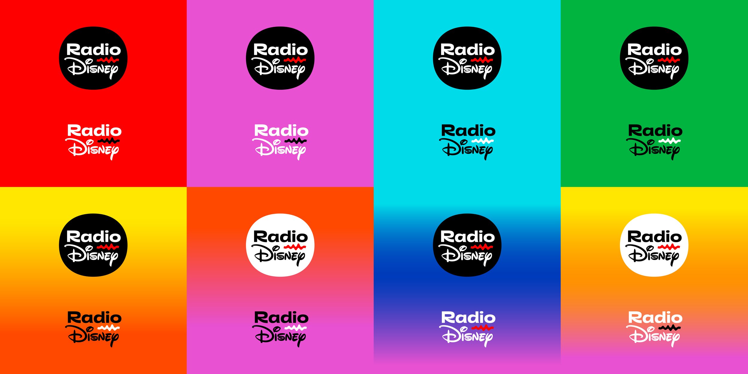
We had the huge privilege of working on the complete rebranding of Radio Disney Latin America. An energetic identity, full of color and in constant movement.
This rebranding features the redesign of its iconic logo and the incorporation of a new element of enormous prominence within the identity system, the sound wave, which accompanies it, and becomes the most synthetic graphic representation of this new visual universe of Radio Disney.
Radio Disney is a space in which to express one's own voice. For this reason, and for all Radio Disney Latin America communication, we developed a "custom" typographic family, through which their own voice is built, that organizes and gives visual form to what Radio Disney has to say.
esp.
Tuvimos el enorme privilegio de trabajar en el completo rebranding de Radio Disney Latinoamérica. Una identidad enérgica, llena de color y en constante movimiento.
Este rebranding cuenta con el rediseño de su icónico logotipo y con la incorporación de un nuevo elemento de un enorme protagonismo dentro del sistema de identidad, la onda sonora, que lo acompaña, y convirtiéndose en la representación gráfica más sintética del nuevo universo visual de Radio Disney.
Radio Disney es un espacio en el que expresar la propia voz. Por esta razón y para toda la comunicación de Radio Disney Latinoamérica desarrollamos una familia tipográfica “custom”, a través de la cual se construye una voz propia que ordena y da forma visual a aquello que Radio Disney tiene para decir.
Credits / Créditos
Developed by YaniGuille&Co. for Radio Disney Latam.
Art and Creative Direction: YaniGuille&Co. (Yani Arabena, Guille Vizzari, Agustín Pizarro Maire), and Disney Latam Team.
Type Design: YaniGuille&Co.
Animation Direction: Martín Ayerbe.
Animation: Martín Ayerbe / Andrés Molteno.


For the “2 line logo” positive and negative space were thoroughly calculated to build a cohesive symbol, ensuring as well optimal performance in small sizes.
This construction grid shows how complex –yet simple– the relations between elements are within the logo.
Note the diacritic for our friends in Brazil! ;-)
Radio Disney logotype construction:
“Radio” word set in RADIO DISNEY SANS (the custom font made by YaniGuille&Co. for Radio Disney) + Disney original logotype + the Sound Wave + the Pill.


Construction grid for the “1 line” logotype version. “Radio” and the Sound Wave keep the same relation as in the “2 line” version, while the wordmark “Disney” is aligned and scaled to march x-height.


Its construction is based on the graphic synthesis of the sound spectrum of the spoken phrase "Radio Disney", reinterpreted as a wavy line, articulated with the elements of the logo.
Construction grid for the “Sound Wave” pill logotype version. Consistency is carefully achieved by using the dot of the “I” as the measurement unit, just as in the brand new logotype shown above.